Showing posts with label Ms Office. Show all posts
Have a presentation at work/school involving graphs and you have no
idea how to make them? Well, step 1 would be to breathe and calm down
for a bit. And the next step would be to realize that mastering graphs on Microsoft Excel is actually not all that hard.
 If you have your data right, you can just arrange it in any number of
rows and columns and get a graphical representation of your data.
Here’s how to do it.
If you have your data right, you can just arrange it in any number of
rows and columns and get a graphical representation of your data.
Here’s how to do it.

It’s best to give a name to the chart that may or may not be part of a bigger presentation. I’ve given the name (Chart: Year v/s Inflation %) right below my data, but you can do so anywhere.
Once you click on any chart, the basic idea is to have the data sorted on X and Y axes as planned. So, right click on the space which gets created when you click on the graph and choose Select Data.
 If you have anything in the box titled Legend Entries (Series) then select it and hit Remove. Once it’s blank, go ahead and click Add and here select the Series Name as the name of the chart, which I had named as Chart: Year v/s Inflation %.

Next is selecting the X values and Y values for the series and that can easily be done by selecting the data from the respective columns. Make sure that you only select the data and not the name of the column. Once all three are selected, hit the OK button and voilà, you have your graph ready.

If you need to change the look of your graph, then the second option, Style, will come in handy. Hovering over some of these options will give you a quick idea of what your graph will look like in the end. The same can be done by clicking DESIGN option from the top and clicking at various options, as shown below.
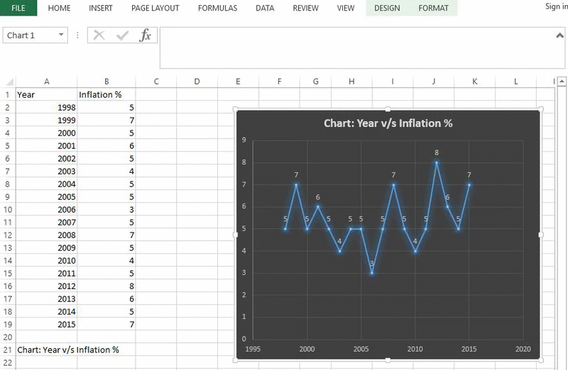
If you wish to further enhance it, then go back to the top, click Design and then click Quick Layout and then try out a few layouts that may suit your needs. If you want the axes names to be highlighted, I’ve found Layout 3 to be most useful. There are more options here, to add shadow effects, to give better borders. So, spend some time and get it right.

All it takes is a little know-how and a quick decisive mind. If it looks good to you, it will look good to your peers and supervisors. Get a second opinion if you must, but not before exploring the possibilities.
Want brilliant looking graphs like these? Read on | Shutterstock
Plot Your Axes
Like any other MS Excel trick, you have to start somewhere. Open a blank Excel sheet and decide your X axis and Y axis data. For my example, I’ve chosen Year v/s Inflation % for each year. It’s random numbers, but you should get an idea of how you can incorporate this in your own graph.It’s best to give a name to the chart that may or may not be part of a bigger presentation. I’ve given the name (Chart: Year v/s Inflation %) right below my data, but you can do so anywhere.
Creating by Selecting
Once your data is ready, click on the Insert tab from the options at the top and then ponder a minute trying to see which graph fits best for your presentation. If you’re unsure, you can change it later, so let’s not worry too much about it now.Once you click on any chart, the basic idea is to have the data sorted on X and Y axes as planned. So, right click on the space which gets created when you click on the graph and choose Select Data.
Ensure this box is empty when you begin
Next is selecting the X values and Y values for the series and that can easily be done by selecting the data from the respective columns. Make sure that you only select the data and not the name of the column. Once all three are selected, hit the OK button and voilà, you have your graph ready.
Editing Graphs
Once your graph is ready, you can edit it further to your liking. If you hover over it, you see 3 options on the right of the graph. The first is Chart Elements which lets you add or remove things which you don’t like. For example, if it’s a long graph with increasing complexities, it might make sense to keep the box Data Labels checked, as this will indicate values right on the graph itself.If you need to change the look of your graph, then the second option, Style, will come in handy. Hovering over some of these options will give you a quick idea of what your graph will look like in the end. The same can be done by clicking DESIGN option from the top and clicking at various options, as shown below.
If you wish to further enhance it, then go back to the top, click Design and then click Quick Layout and then try out a few layouts that may suit your needs. If you want the axes names to be highlighted, I’ve found Layout 3 to be most useful. There are more options here, to add shadow effects, to give better borders. So, spend some time and get it right.
Master PPT: Read our article on mastering PPT with these great tips, which will go a long way to enhance your skills.
Give it a Try
Things usually look pretty tough when you don’t know how, but would you believe that I made the chart below in less than 3 mins?All it takes is a little know-how and a quick decisive mind. If it looks good to you, it will look good to your peers and supervisors. Get a second opinion if you must, but not before exploring the possibilities.
Gathering data in Microsoft Excel isn’t all that hard. But, sorting, validating, adjusting, looking up values
and such is pretty hard. Some functions may not be as popular as
others, but if you know these, it will reduce your workload by a whole
lot.
 Let’s look at Reference Functions in MS Excel.
All you need to do is supply the value you’re searching for, a range to search within and an (optional) argument on how to perform the search. Usually, this argument is specified by the number 0, meaning you want an exact match.
 Ok, don’t let that confuse you. Let’s look at a straightforward
example where an excel sheet of Orders against Profit has been used.
Here we’re looking for the maximum profit but also looking at the order
quantity corresponding to it. Since it’s a simple sheet, we can pinpoint
them easily, but what if it was 10 times more complex?
Ok, don’t let that confuse you. Let’s look at a straightforward
example where an excel sheet of Orders against Profit has been used.
Here we’re looking for the maximum profit but also looking at the order
quantity corresponding to it. Since it’s a simple sheet, we can pinpoint
them easily, but what if it was 10 times more complex?

That’s when we need to know formulas. And do that in the Profit row, I need to simply enter the below formula –
It’s simple, we kill the Batman. Um, I mean you kill the overthinking of your brain functions and simply use the same formulas for all the cells where results need to be shown. And the best way to drag a formula to adjacent cells is to drag it across.

This can be done for both, Match as well as Index functions.

Don’t be afraid of finding the right data in complex sheets | Shutterstock
What are They?
When you want to find a match (not the Tinder kind), you might need to scan a long while in an Excel sheet overflowing with data. But, there are functions that will do the hard work for you, provided you use them the right way.All you need to do is supply the value you’re searching for, a range to search within and an (optional) argument on how to perform the search. Usually, this argument is specified by the number 0, meaning you want an exact match.
How Does it Work?
So, let’s say you were searching in a big Excel file for a certain value and the function found it in the 3rd row, the Match function will return a value of 3. Match functions work in conjunction with the Index functions, sometimes Match providing the index for the Index function.
Matching ain’t easy
That’s when we need to know formulas. And do that in the Profit row, I need to simply enter the below formula –
=Max(B4:B8)This formula needs to be entered where you wish to see the results. Now, to get the corresponding Order quantity matching the result you get from the above formula, you need to use the Index function. So, below the Order Quantity table, type this formula –
=Index(A4:A8,match(B10,B4:B8,0))Again, the 0 used in the end only indicates that we want an exact match to be displayed.
Handle With Care
If your Excel data is more complex you need to be more careful. I’ll show another example, where I’ve taken the same numbers as the previous example but also added additional columns for stockout costs. How do you find the best profit and corresponding order quantity from here?It’s simple, we kill the Batman. Um, I mean you kill the overthinking of your brain functions and simply use the same formulas for all the cells where results need to be shown. And the best way to drag a formula to adjacent cells is to drag it across.
This can be done for both, Match as well as Index functions.
Please Note: We add the $ symbol in the formula to keep the ‘reference’ column constant, as the A column is constant for all inputs here.
Ex-Cell?
We’d like to hear how many of you really find more usage of MS Excel at your work or school. Also, what are the common hurdles you face while using it.
If you’re making presentations to impress your co-workers or your
boss (or both), then it becomes imperative to get you right. Nay,
perfect. In this quest of perfection, there is a great option in Microsoft PowerPoint that will help you in making a big impression. Let’s explore Smart Guide.


Simply drag an object and bring it in close proximity of the other object and you shall see red dotted lines which act as guiding lines to tell you where you need to place your object. As soon as you see them, you can align your objects accordingly.

Till you don’t see this arrow, keep finely adjusting your new object. This not only works with your mouse but if you have a touchscreen device, it works well with that too. This used to be very hard to do in earlier versions, now it’s a matter of dragging it and waiting for Smart Guide to help you along.

You can also use these grid lines to see exactly how much space and where in your presentation are your objects located. Grid lines can’t really replace the alignment functionality of Smart Guide, but they are pretty close. A clever use of these is to ensure that the object you’ve created is a perfect square or not.
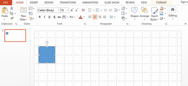
Another cool keyboard shortcut is the arrow key to move around objects. For example, I want to move my newly created perfect square across the PPT, I can simply hold down the right arrow key to take it there (as seen in the GIF above). In earlier versions of MS Office, this simple step used to take up a lot of time. Not anymore.
Using the arrow key also ensures that the object will move in a straight line, which isn’t always the case when dragging with the help of a mouse.

You’ll notice a very small difference here, but it certainly is there. The lack of fluidity is perhaps felt more on touchscreen devices than regular desktops and laptops.
PPT looking confusing? Use smart guide | Shutterstock
How it Works
When you play around with objects (like pie charts and such), it is sometimes difficult to align things in a single PPT file. If you have multiple such objects and you want to align them perfectly, the Smart Guide feature can be your savior.Simply drag an object and bring it in close proximity of the other object and you shall see red dotted lines which act as guiding lines to tell you where you need to place your object. As soon as you see them, you can align your objects accordingly.
Positioning Perfection
If you have two objects already in your PPT and want to insert another one, but, ensuring that the new object is equidistant to both; use Smart Guide. By default, Smart Guide will auto-detect the new object being inserted and will show small arrow signs indicating that it is perfectly centered.Till you don’t see this arrow, keep finely adjusting your new object. This not only works with your mouse but if you have a touchscreen device, it works well with that too. This used to be very hard to do in earlier versions, now it’s a matter of dragging it and waiting for Smart Guide to help you along.
Shortcuts and Other Features
Of course, there are other ways to align your objects perfectly in PowerPoint. Like the grid that will basically lay out a nice row of squares for you. You can use this as your guiding parameter. Hitting Shift key simultaneously with F9 will give you direct access to it.You can also use these grid lines to see exactly how much space and where in your presentation are your objects located. Grid lines can’t really replace the alignment functionality of Smart Guide, but they are pretty close. A clever use of these is to ensure that the object you’ve created is a perfect square or not.
Another cool keyboard shortcut is the arrow key to move around objects. For example, I want to move my newly created perfect square across the PPT, I can simply hold down the right arrow key to take it there (as seen in the GIF above). In earlier versions of MS Office, this simple step used to take up a lot of time. Not anymore.
Using the arrow key also ensures that the object will move in a straight line, which isn’t always the case when dragging with the help of a mouse.
Snapping to Grid
A cool new feature with MS Office 2013 has been the ability to smoothly change the size of any object. In the older versions, it used to change minutely, based on grid sizes. You can still get it back if you wish. All you need to do is navigate to VIEW and then go to Grid Settings right under Notes and in the window that opens up ensure Snap objects to grid is checked.You’ll notice a very small difference here, but it certainly is there. The lack of fluidity is perhaps felt more on touchscreen devices than regular desktops and laptops.
Too Smart for You? In the same
box shown above, you can uncheck the smart guide option if you think
it’s too smart for your liking. But I highly advise against doing that.


